
Dozens of new organisations are getting ready to publish IATI data: the Dutch Ministry of Foreign Affairs made it a requirement for the grantees in the strategic partnerships programme on lobby and advocacy that started this year.
The Ministry has published their guidelines on how to create a useful IATI data set, and part of those guidelines (chapter 3) is an overview of how to represent the structure of funding and activities.
I’m helping organisations get their data in order, and so I was looking for an easy way to see the structure of activities in their data. Browsing through XML data only gets you so far…
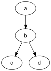 So I turned to some of my favourite tools: dot and graphviz. With a simple text file like this
digraph graphname {
  a -> b -> c;
  b -> d;
}
you can create the image on the right.
It’s not difficult to create an input file for dot from some IATI data. I’m polishing my code a bit still before publishing, and I’m focusing on two aspects now:
- related activities
- participating organisations
Still to add: looking at transactions to find further links.
It works for a few prototype data sets I have, but those are not public yet. Two examples to show what this can do.
Akvo
One of the first public data sets with related activity information I looked at is from Akvo. The resulting image is quite interesting:
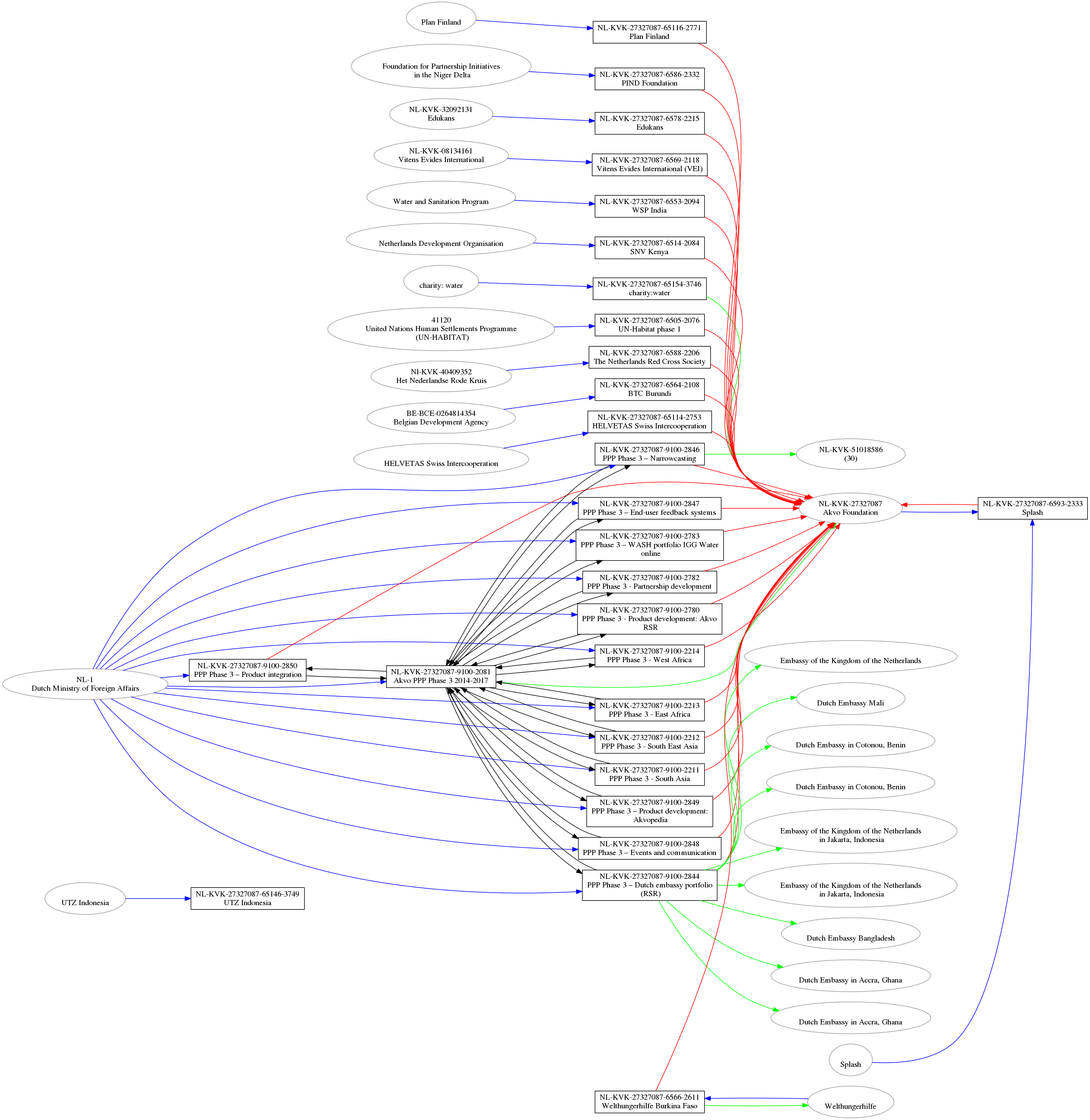
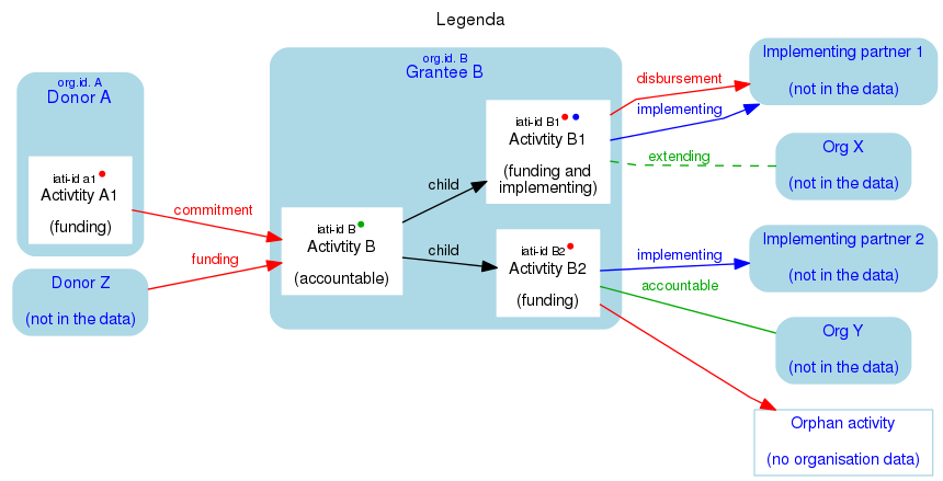
- blue lines: funding
- green lines: implementing
- red lines: accountable
- dotted lines: extending
- black lines: related activities
It already resulted in a conversation with Yohanna Loucheur on Twitter about the use of participating organisation role “accountable” (the red lines in the image). There is lot to be done still to make the definitions and explanations around the standard clearer.
Also, it appears as if the Dutch Ministry is funding a lot of individual Akvo activities (all the blue lines on the left). I suspect that it actually is a single grant to PPP Phase 3, from which Akvo funds the individual activities.
Another interesting thing is that Akvo has a lot of two-way child relations:
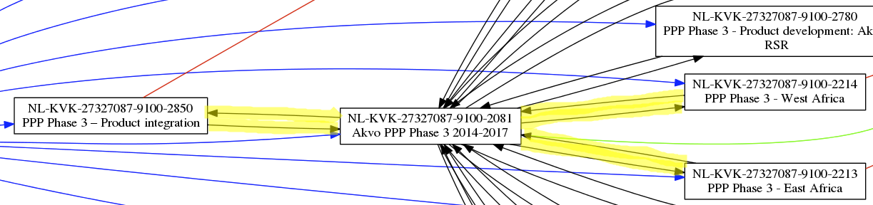
This is clearly an error in the data.
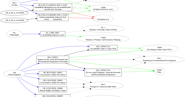
Combined IATI data
Another example: examining the relations based on a query across all IATI data.
I use BaseX to have all published files available in a single database (more precise: all files that are considered valid XML). That makes it possible to create a new set of activities with just the fields I need.
For instance: lets look at all activities currently underway in Rwanda that deal with “Civilian peace-building, conflict prevention and resolution”. As an Xquery:
<iati-activities>{
  for $activity in (//iati-activity)
  where $activity/recipient-country/@code="RW"
    and $activity/activity-status/@code="2"
    and $activity/sector/@code="15220"
  return <iati-activity>
    {$activity/iati-identifier}
    {$activity/reporting-org}
    {$activity/title}
    {$activity/participating-org}
    {$activity/related-activity}
  </iati-activity>
}</iati-activities>
The resulting “pseudo” activities file transforms into the following image:
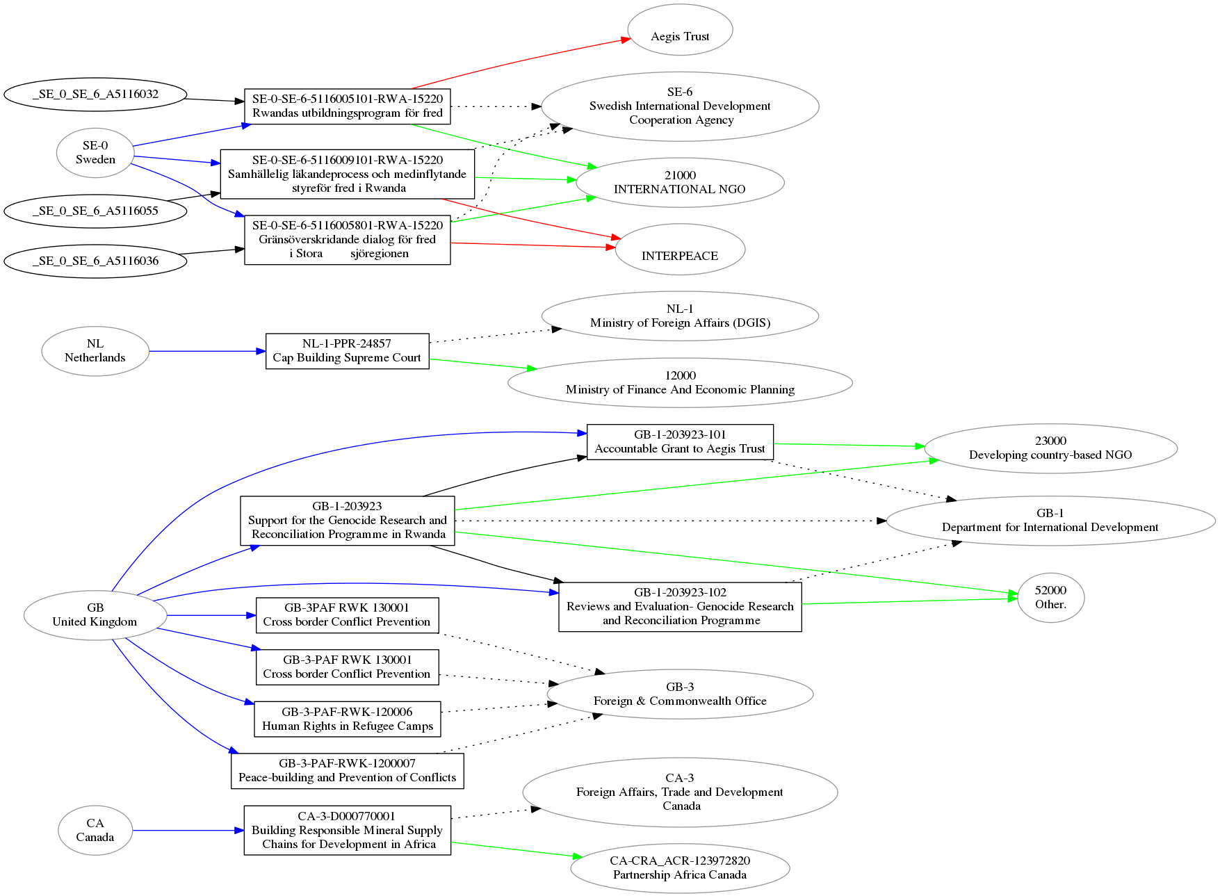
Again, some things here look wrong. For instance, it seems an activity is duplicated with a slightly different identifier:
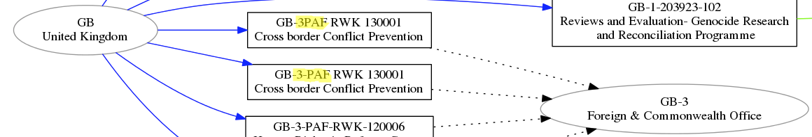
This might be an error in the data of the Foreign & Commonwealth Office. They have chosen GB-3 as their organisation identifier, although this is not on the official list…
It’s work in progress, if anyone wants to sponsor this :-). So far it helps me spot areas for further investigation into possible errors.
Update 5 Feb
I have new versions of the graphs above, to make it easier to see activities within an organisation. The colours have changed: red is funding, blue is implementing, green is accountable or extending. Coloured dots in an activity indicate that the organisation in which the activity resides is listed as funding/implementing/accountable.
 To make it more scalable they’re in SVG format now. Here is Akvo’s graph, and here is the example query about Rwanda.
Update 8 Feb
Akvo released a new data set on the day I started experimenting with their data. The new Akvo graph looks a lot more like what I’d expect to see!
RT @hapeeg: Examining structures in #IATI https://t.co/O9Biek7LsT via @rolfkleef #opendata
Lekker bezig, @rolfkleef https://t.co/ScZjSame0e
Interesting iteration! Examining structures in IATI https://t.co/toWltcygHv via @rolfkleef
“Examining structures in #IATI” by @rolfkleef, based on @akvo’s IATI file https://t.co/x7rZa9poUz
Analyzing #IATI structures w #dataviz to identify errors in relations & activities @rolfkleef https://t.co/lcUVtZIzmR ht/ @tristanvaessen
RT @tristanvaessen: Interesting iteration! Examining structures in IATI https://t.co/toWltcygHv via @rolfkleef
Rolf, you may want to indicate that rectangles are projects and ovals are organisations (perhaps next to the chart for line colours). Took me a while to figure it out since I wasn’t able to read clearly the text inside the boxes/ovals.
BTW, I really like how something like this could help identify errors in the data, thus increase quality.
This was just a first pass to see how easy or hard it would be, I’m working on a next iteration that hopefully is again more self-explanatory. And you might want to right-click and save or view the image at full-scale to be able to read anything…
RT @KasperBrandt: “Examining structures in #IATI” by @rolfkleef, based on @akvo’s IATI file https://t.co/x7rZa9poUz
@rolfkleef love your blog about structures in #IATI & the #Akvo example https://t.co/0J7DvFUMwj Let’s talk about how we can improve our set!